FOOT PATH
fine foraged
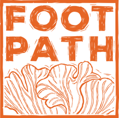
LOGO DESIGN
Three logo system
BRAND DEVELOPMENT
Telling a story through brand
WEB DESIGN
Website, Mobile, and Event screen
Foot Path is a food festival and fund-raiser, that promotes foraged food and environmental consciousness. Partnered with Foot Path is the Nature Conservancy of Canada (province) & Grand River Conservation (local). The festival stands to raise awareness concerning Canadian forests and agriculture. This festival comes at the failed passing of Bill 66, which would have endangered Canada’s Green Belt. To capture the interest of an environmentally aware audience, the logo stresses earthy craftsmanship. Foot Path’s three logos are styled and textured to look like a woodcut block. A little crude, as most handmade artwork is. Our reasoning for creating three logos interchangeable with each other is to represent the diversity of the forest. The color pallet is a dark brown and a 50% lighter tint to make a dusty brown to be used as monotone overlays.
In partnership with Tajiana Dudas
UX/UI
Event package and event screens